At Wesley Hall, Bunny Williams and Peter Jacob talk trends and color
Bunny Williams and Peter Jacob are being featured in the Wesley Hall showroom, offering two distinctive and different perspectives on home.

HIGH POINT — At this week’s High Point Market, new introductions by designers Bunny Williams and Peter Jacob are being featured in the Wesley Hall showroom, offering two distinctive and different perspectives on home.
As a precursor to fall’s fresh looks, Wesley Hall President Zack Taylor queried his two licensees to find out what might be influencing their designs at the moment and to offer a sneak peek at what might be coming in the months ahead.
“Our industry is rife with talent, colorful souls and differing perspectives,” Taylor said. “Wesley Hall’s array of silhouette and scale proudly and deliberately offer something for everyone. Through our inherent creativity and that of our licensed partners, we purposely maintain a broad offering of styling with proven and enduring comfort, tailoring and construction.
“Designers Bunny Williams and Peter Jacob serve as the ideal bookends to our collection,” he continued. “While equally graceful and timeless, each offers a unique and fresh prevue on our craft: Bunny is more curvilinear and classic-leaning, while Peter’s penchant leans more architectural and modern. Further, each in their own way, represents the best our industry has to offer — equal parts strong, vibrant and ever-evolving. They keep us on our toes and aiming high!”
What up-and-coming design trend excites you most?
Williams: I have always loved painted floors and am excited to see them being used more.
Jacob: There’s a notable shift toward warmth and saturated colors. It’s a lovely way to create comfort and a sense of embrace. It’s also in keeping with a turn I’m seeing toward handmade, collected and truly antique items and accessories around the home. The pairing feels like an approachable way to shift toward meaningful spaces and possessions.
In contrast, what trend are you glad to see on its way out?
Williams: One-note color schemes.
Jacob: True minimalism will always be a design style I admire, but it’s great to see “plain” on the way out. Illustrated by too much space between conversation areas, small and detail free lamps and accessories … even a single item at the center of a dining table can look ungenerous and feel like an afterthought. Let’s call it the Air B&B Effect: too few items with little to no personality. Let’s enliven our spaces and include quirk and idiosyncrasy.
Which movie set has inspired you the most?
Williams: One of my favorite films is Indochine, which is set in French Indochina during the 1930s to 1950s.
Jacob: I’ve watched Gattaca too many times to count. It’s my “sick on the sofa” movie. It was released in 1997 but predicted a future where minimal, mid century design lives alongside roadsters from the 1980s and wardrobe from the 1940s. The movie shows us how style can be blended across decades, defying trend and steering us toward timeless combinations.
What’s your favorite Wesley Hall silhouette?
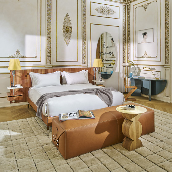
Williams: I love the Antoine Bed. Interesting beds are so hard to find, and this one has a great shape.
Jacob: Am I allowed to say the Tulip chair? I ask because it’s one of my own designs for our collaborative brand. What I hope the Tulip chair shows are classical lines, interpreted in a fresh way combining comfort and a sort of brightness in a reminiscent form.
What are your top three go-to paint colors?
Williams: White Sand by Benjamin Moore is a favorite neutral; Cleveland Green, also by Benjamin Moore, is a favorite mossy green. I also love Blue Ground by Farrow & Ball.
Jacob: 1) Etiquette AF-50 by Benjamin Moore. I’ve used it for many transitional spaces in many homes. It’s a nutty shade of Off White that feels like a hug.
2) Deep River Green 5010-3 by Valspar. It’s like living inside of a ring box. Plush green saturation with a hint of blue. Feels like mother nature approved this one.
3) Elephant Gray 2109-50 by Benjamin Moore. I don’t like gray, never have. This gray though has a lot of warmth and life. When I was in design school, we used Prisma Markers. Remember “Warm Gray 70%”? This is that color as paint.
See also:
What's Your Reaction?


