Breeze blocks, openness and voids – a Singaporean villa worth exploring
Designed by Insight.Out Studio, this family maisonette has an unexpected fusion of fun and styles. The post Breeze blocks, openness and voids – a Singaporean villa worth exploring appeared first on Habitusliving.com.
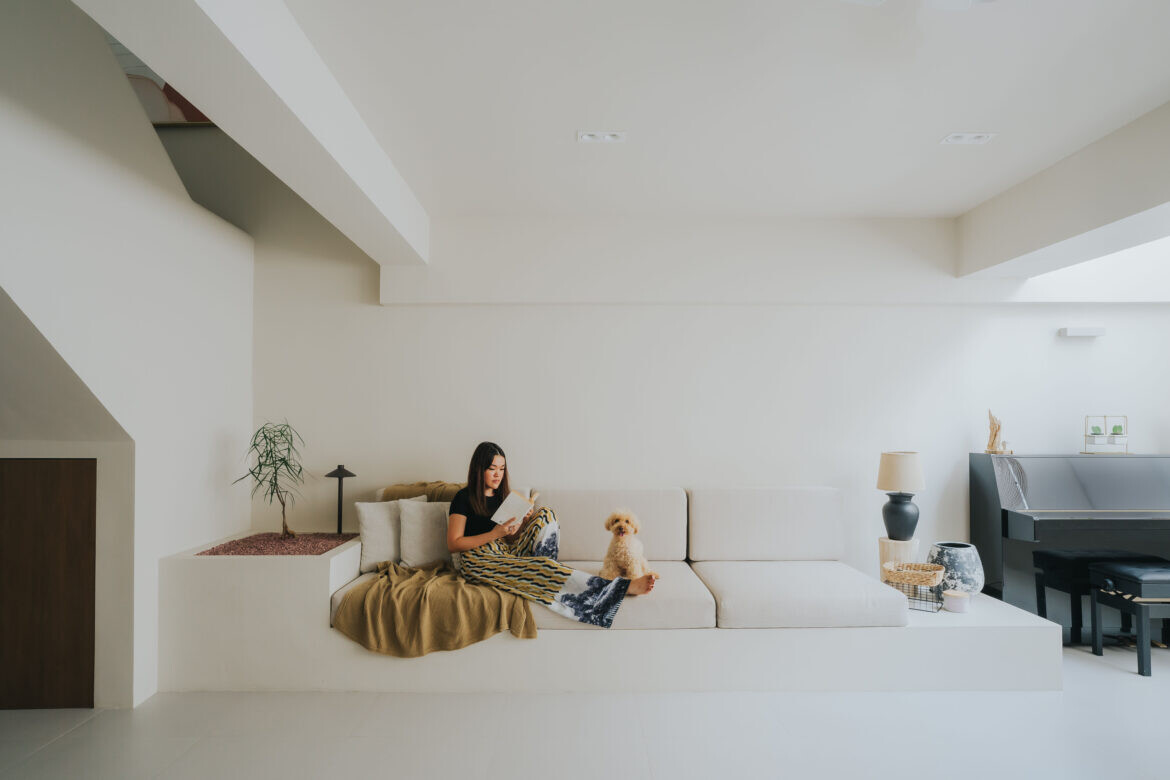
Minimalist resort meets American farmhouse – these sound like an unlikely design mishmash and yet, they work harmoniously in this Housing Development Board (HDB) maisonette in Jurong West, Singapore.
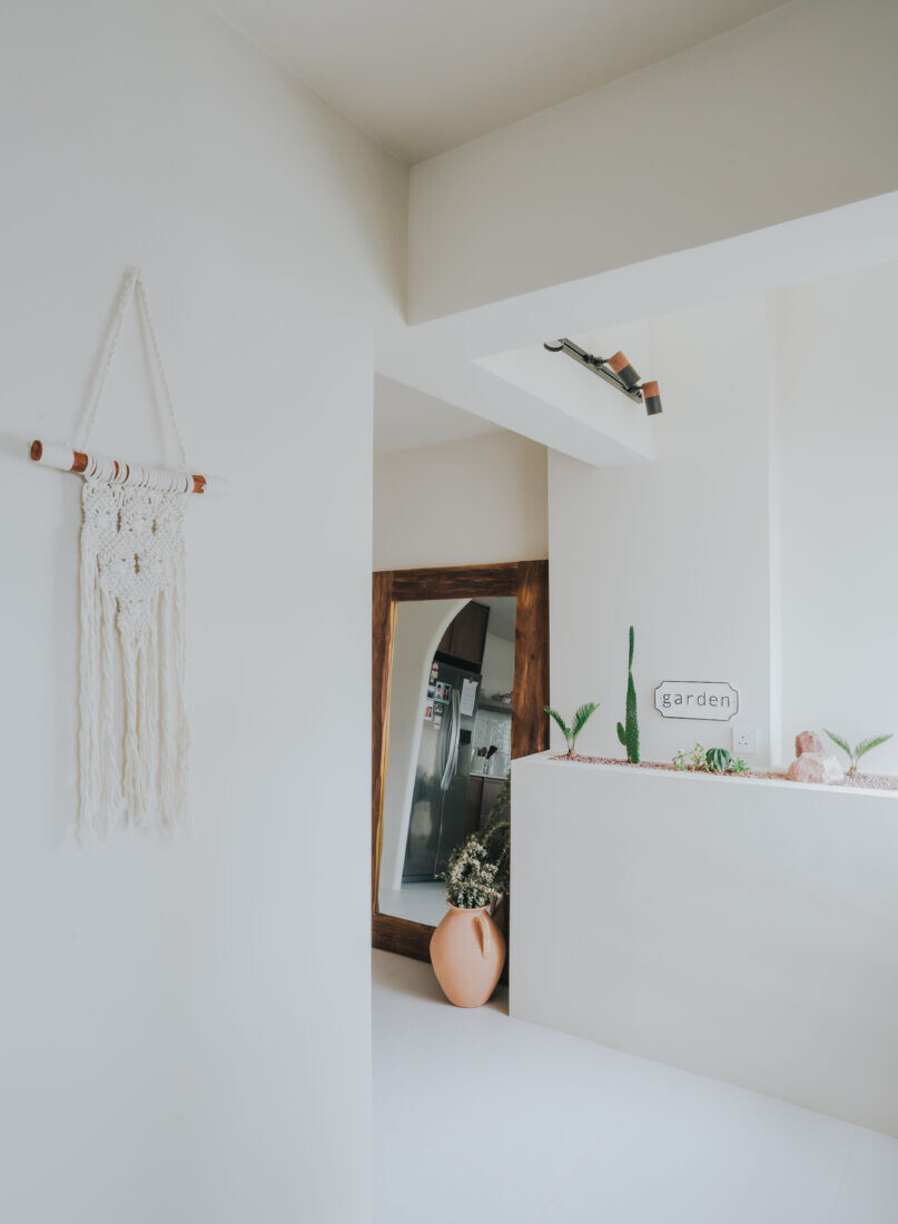
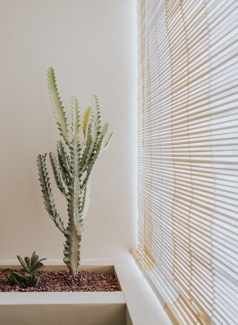
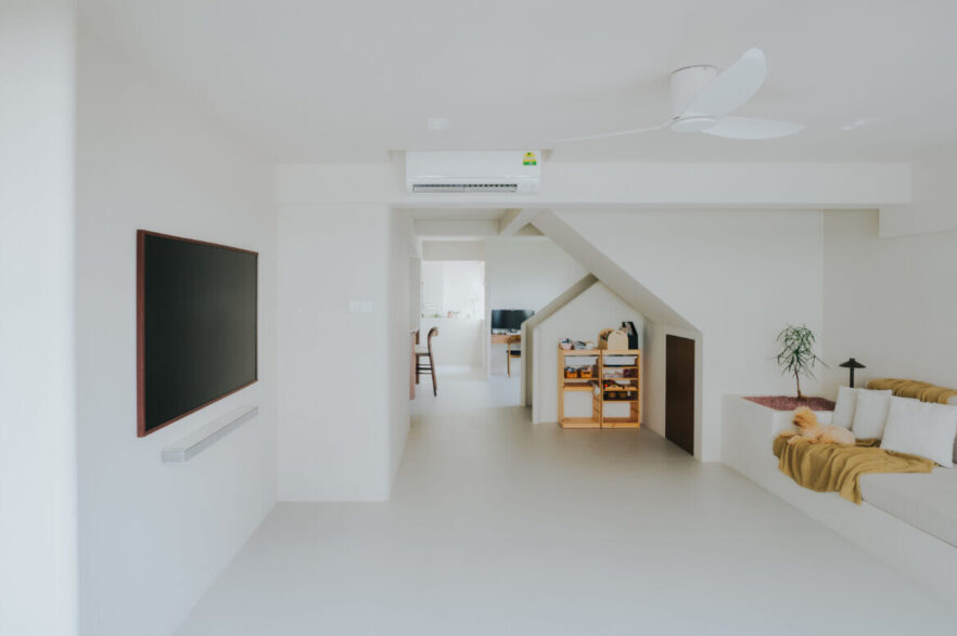
Designer Mandy Low from Insight.Out Studio was tasked by her clients to incorporate a blend of styles that would hold together. The homeowners were also passionate about unwinding at home and living a well-rounded lifestyle. As such, Mandy focused on designing an open floor plan and spaces with lots of textures, ample light and good airflow to evoke tranquil living and to be conducive for entertaining. Concrete planters were also constructed in areas for gardening and to allude to the idea of a Bali villa.
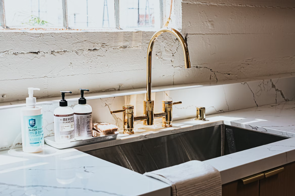
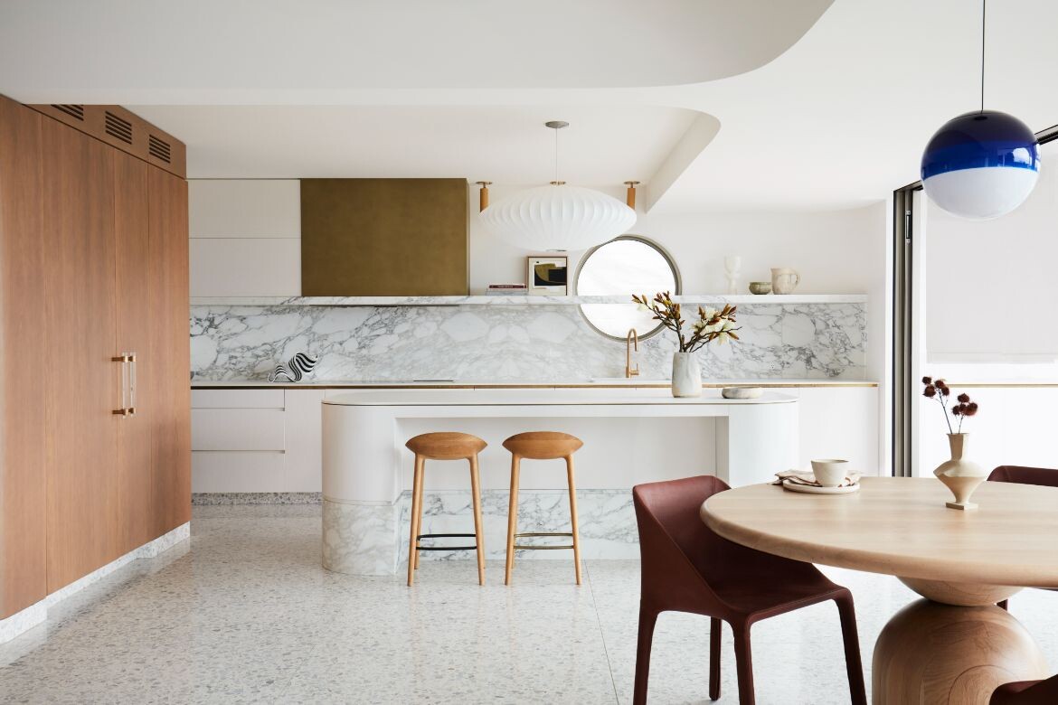
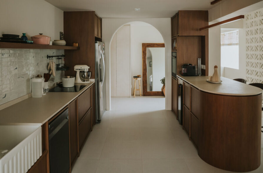
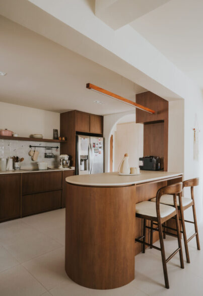
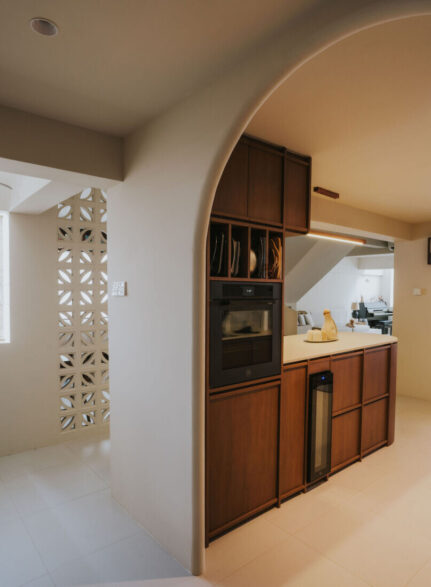
“Most of the original walls have been demolished to cater for open plan living, like the first level’s utility room which was knocked down to extend the kitchen,” says Mandy. With its removal, the kitchen now presents a much more spacious visage – perfect to accommodate shaker-style cabinets and a generous farmhouse-inspired sink.
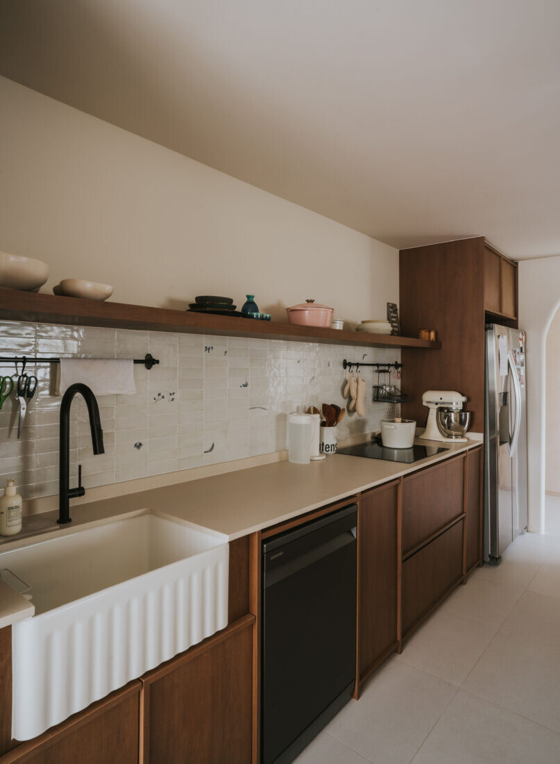
“For a contemporary minimalist spin to the shaker cabinets, the edges of the wood panels have been slimmed down,” says Mandy. This modern rendition helps to reduce the visual bulk that would otherwise look ill-fitting in other zones with a clean and minimalist style.
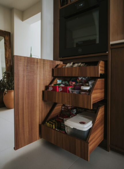
Form meets function too where the kitchen cabinets conceal effective storage solutions, such as slide-out pantry drawers to organise and retrieve items easily.
Framing the entrance of the kitchen is a curved archway. It echoes the graceful curvature of the peninsula counter outfitted with a Dekton Edora countertop, and ties in nicely with the organic forms found in other parts of the home.
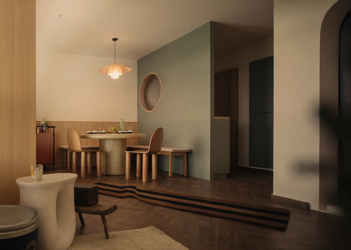
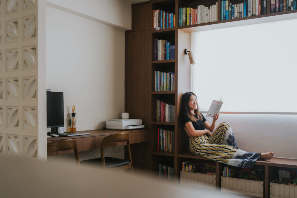
The original dining space is now the study. It resides next to the kitchen, with a breeze block divider to subtly zone the area and for privacy while maintaining good airflow.
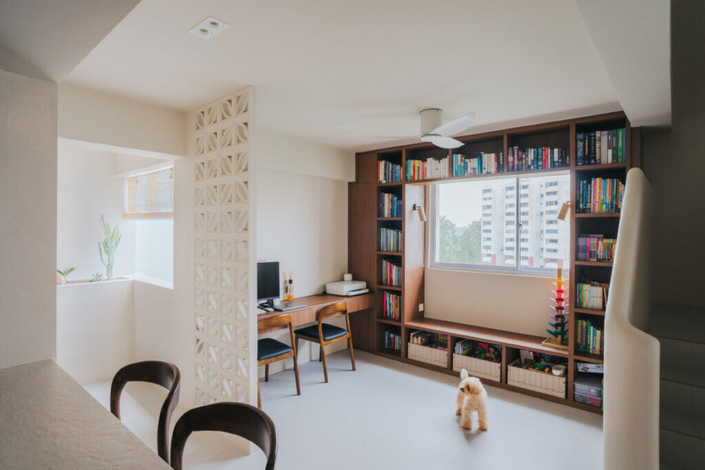
Here, a wall-to-wall storage unit allows the family to store and display books, toys and craft supplies. It also frames the view out the window and functions as a cosy reading nook. Mandy says: “The homeowners have two children and they wanted a designated space to cultivate good reading habits in their kids.”
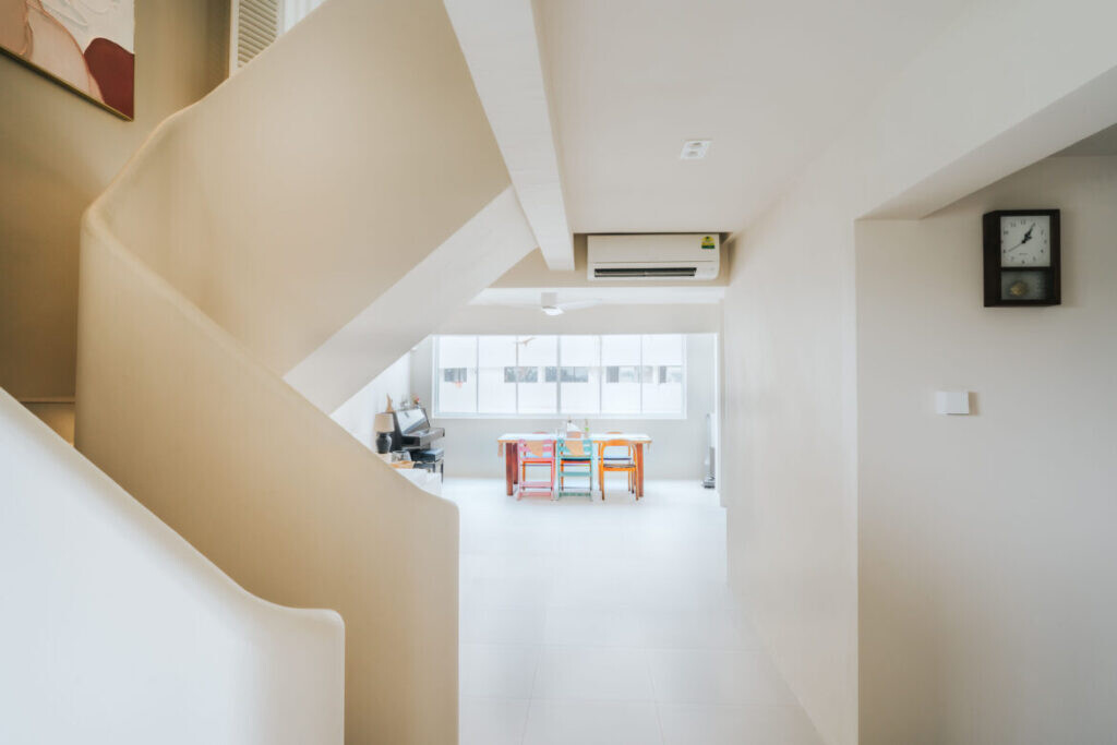
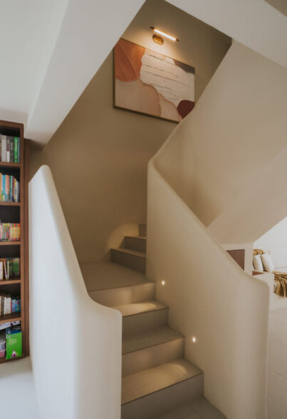
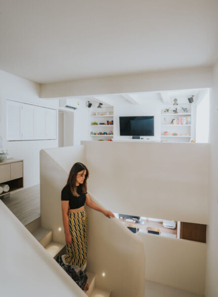
The staircase has been designed with undulating curves. Mandy says: “We wanted to express a softer minimalist detail with these curved elements. The stairs were also modified with a directional change and lights have been added to illuminate the steps for the kids’ safety.”
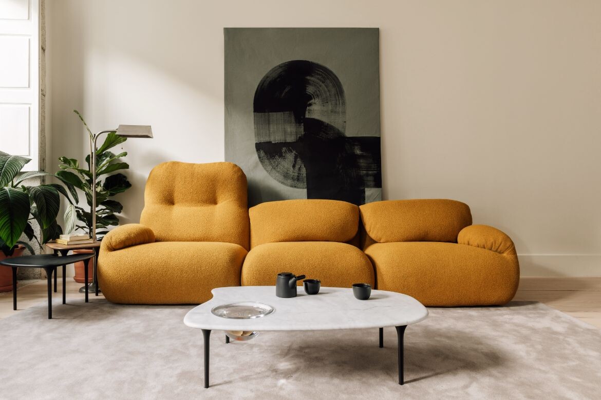
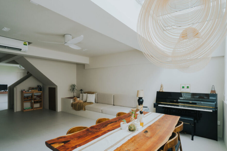
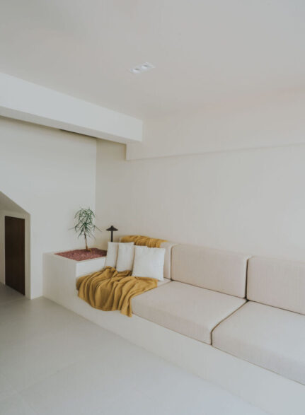
The living area is furnished with a concrete planter and an elongated concrete block to house customised cushions as the sofa. It’s a calm space from which the family can chill, entertain company, and enjoy a touch of nature.
On the other side of the living area lies the original balcony, which has now been converted into a dining area. It adds to a larger expanse of space for the homeowners to entertain more guests comfortably. A glass awning has replaced the previous balcony roof, allowing lots of daylight to enter the communal zones.
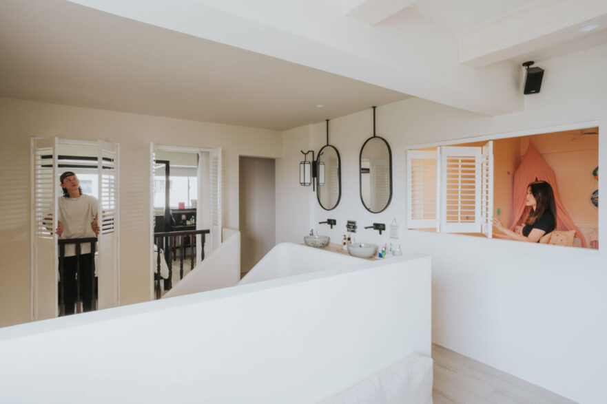
The Spanish Colonial influences are most prominent on the second level. There are plantation shutters along with traditional balustrades installed for the windows that look into the main bedroom, and this unique design alludes to the homeowners’ love for Raffles Hotel.
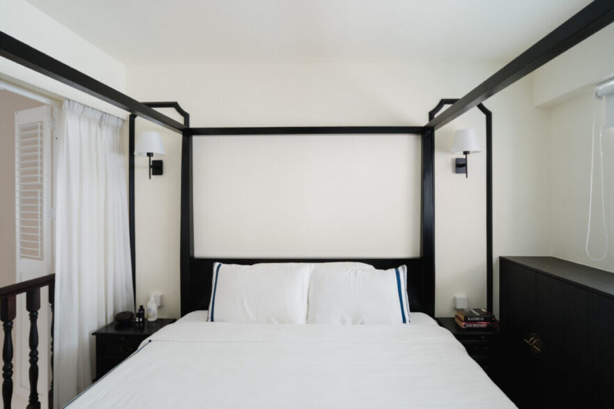
The grandeur of the five-star hotel can also be felt in the main bedroom itself, especially with its classic monochromatic colour scheme and a four-poster bed. For the walk-in wardrobe at the other end, Mandy added reeded glass panels to the shaker-style wardrobe doors for a contemporary touch.
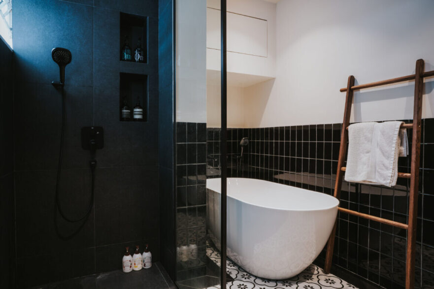
While there were originally two bathrooms on the upper level, Mandy and the homeowners decided to reconfigure the layout and merge the two to fit in a bathtub. However, the vanity has been shifted to the walkway outside, making it easier for the family to access it if the main bathroom is occupied.
Mandy also reconfigured the layout of the two common bedrooms and resized them to accommodate a family area. She says: “The homeowner is a school teacher and she wanted her kids to have their own rooms, as well as a common space to enjoy imaginative unstructured play together.”
This inviting space for the family has been designed to appeal to all the home’s occupants. The designer says: “We added false beams on the ceiling and a traditional plastered faux fireplace, as well as shelving and shaker-style cabinets to form a nice design symmetry.”
With the children’s bedrooms now scaled down to two smaller spaces, the daughter’s room is a new build with no windows. As a solution, folding shutter windows that open out to the common walkway have been employed to introduce daylight and natural ventilation into the bedroom while enabling easy communication with family members.
This concept of ‘connection’ is something that’s repeated throughout the villa-inspired home, and in thoughtful ways that encourage many moments for meaningful bonding.
Project details
Interior design – Insight-Out Studio
Photography – courtesy of the designers

The post Breeze blocks, openness and voids – a Singaporean villa worth exploring appeared first on Habitusliving.com.
What's Your Reaction?


