Mountain Dew aims to "reclaim its legacy" with mountain-focused rebrand
Beverage company PepsiCo has unveiled a rebrand of its Mountain Dew drink with a new logo and packaging focused on its mountain roots. The brand's first redesign since 2009 aims to place the mountain at the core of the drink's identity, with the landscape incorporated into the branding and the word mountain added back into The post Mountain Dew aims to "reclaim its legacy" with mountain-focused rebrand appeared first on Dezeen.

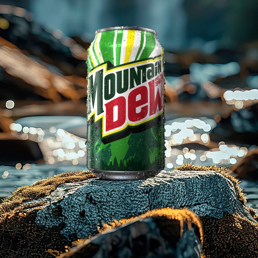
Beverage company PepsiCo has unveiled a rebrand of its Mountain Dew drink with a new logo and packaging focused on its mountain roots.
The brand's first redesign since 2009 aims to place the mountain at the core of the drink's identity, with the landscape incorporated into the branding and the word mountain added back into the logo.
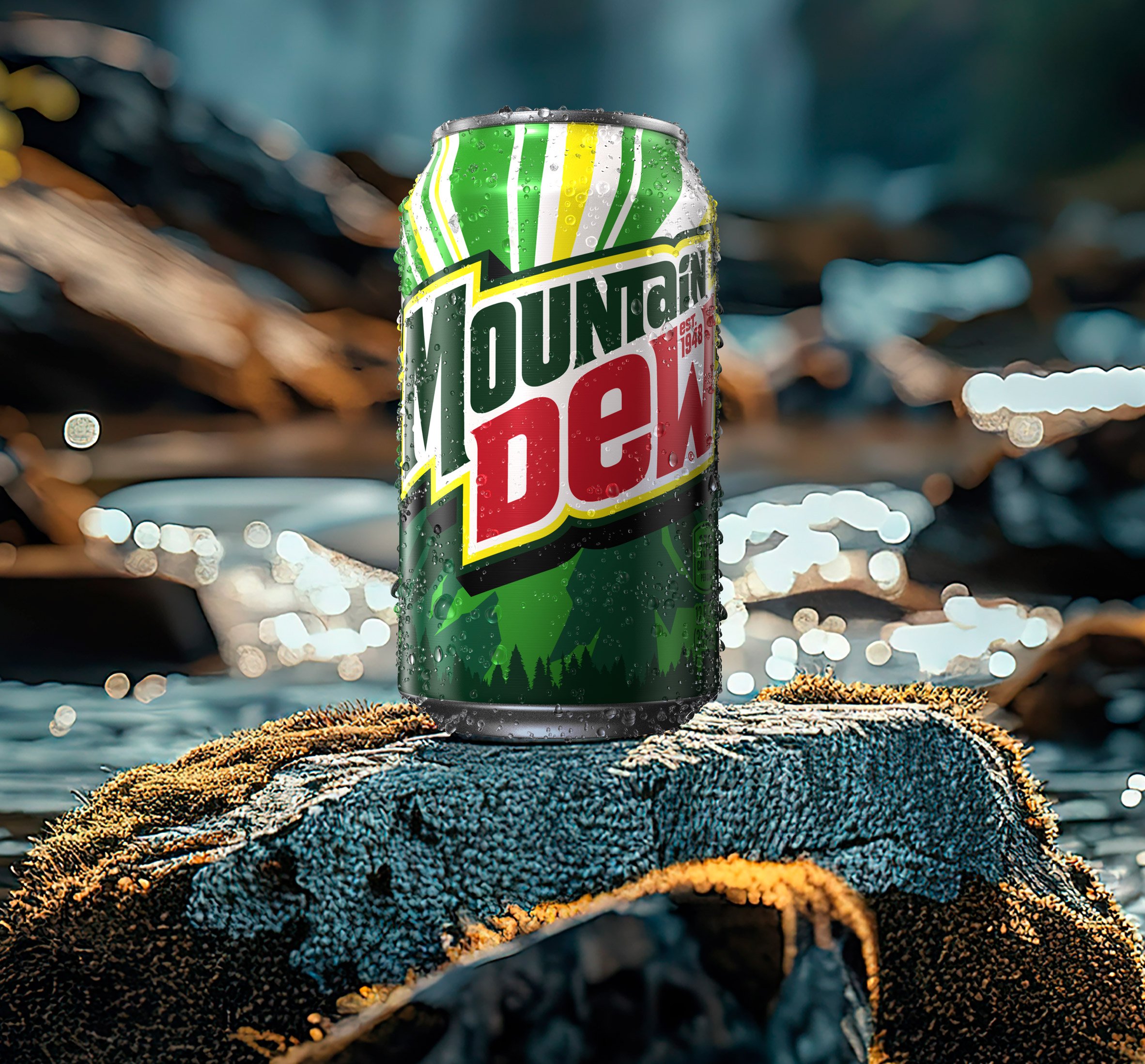
"With this new visual identity, Mountain Dew is reclaiming its legacy with a timeless look designed to elevate both the physical and digital spaces the brand adventures in," said PepsiCo chief design officer Mauro Porcini.
"We're excited for fans to see the new Mountain Dew, which includes an updated logo that embodies the brand’s origins, a sunny refreshed color palette, and graphic outdoor landscapes unique to the Mountain Dew flavors."
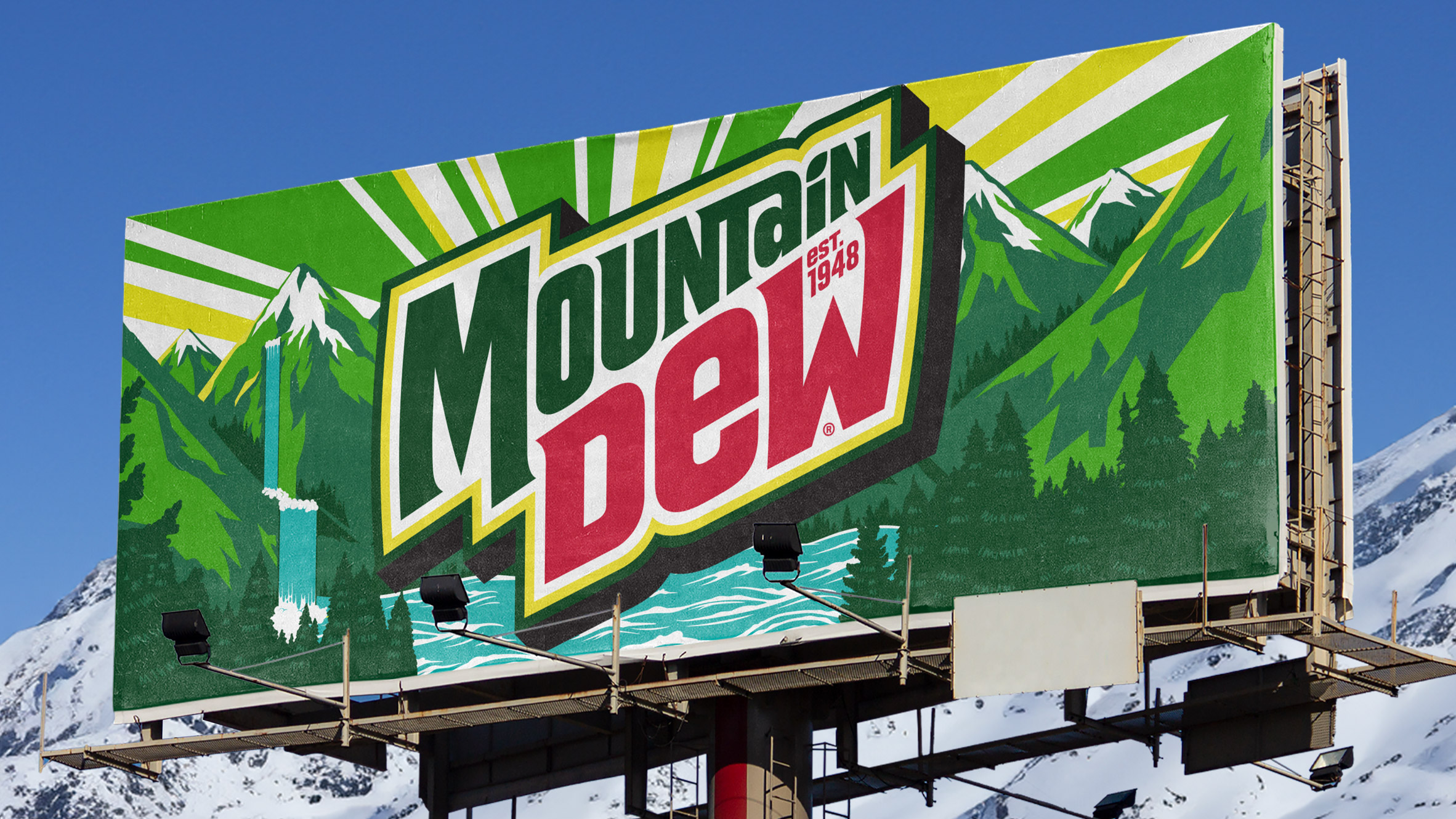
PepsiCo's design team replaced the abstract mountain shapes in Mountain Dew's previous branding with cartoon-like green mountains topped with snow.
The updated logo was informed by previous designs used in the 1970s, 80s and 90s and includes the word mountain, which was previously styled as Mtn.
To further draw attention to the heritage of Mountain Dew, which was first made in the 1940s and trademarked in 1948, the date was established was incorporated into the logo.
A citrus leaf outline was used for the dot of the i as a hint to the flavour.
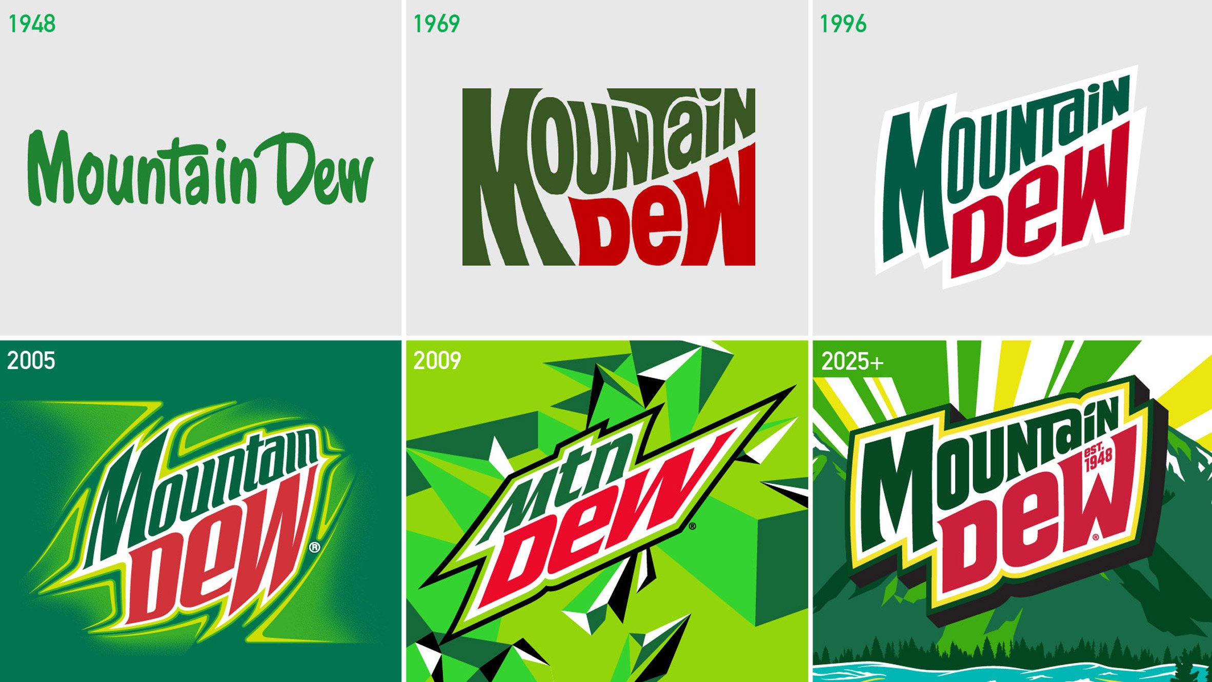
Throughout the branding, curved lines replace the previously angular look, while an updated colour palette has calmer tones of green with an added bright yellow as a nod to the citrus flavour.
According to the brand, the aim was to emphasise that Mountain Dew is "synonymous with adventure".
"Born in the mountains, the distinctive citrus flavor of Mountain Dew propelled the brand to become a global cultural phenomenon, giving us a rich history to lean into as we reimagine the next 75 years of the brand," said Mountain Dew vice president of marketing JP Bittencourt.
"Mountain Dew is reclaiming the mountain with a new logo and visual identity that is synonymous with adventure, celebrating the great outdoors."
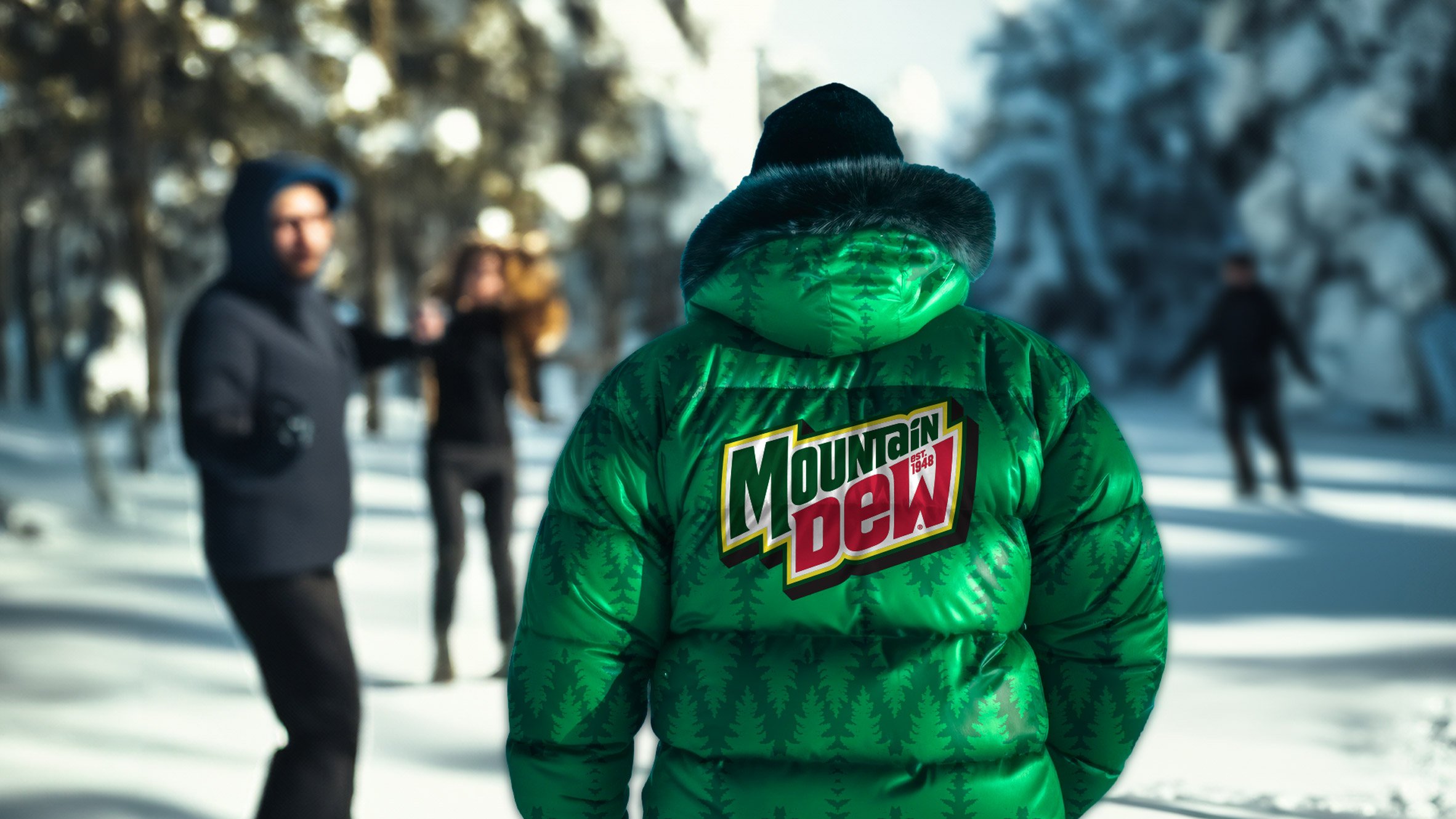
Mountain Dew is the latest brand to be redesigned by the PepsiCo team following Pepsi and 7Up, which were both rebranded last year. Pepsi's rebrand drew on its own 1990s look, while 7UP aimed to reinforce the uplifting nature of the brand with its renewed design.
The post Mountain Dew aims to "reclaim its legacy" with mountain-focused rebrand appeared first on Dezeen.
What's Your Reaction?


