Elizabeth Line designed to have an "elegant simplicity"
This video highlights the Elizabeth Line infrastructure by studios Grimshaw, Maynard, Equation and Atkins, which is one of six projects shortlisted for this year's RIBA Stirling Prize. It is the largest project on this year's shortlist, which is the focus of a short-film series currently being published by Dezeen in collaboration with the Royal Institute of The post Elizabeth Line designed to have an "elegant simplicity" appeared first on Dezeen.

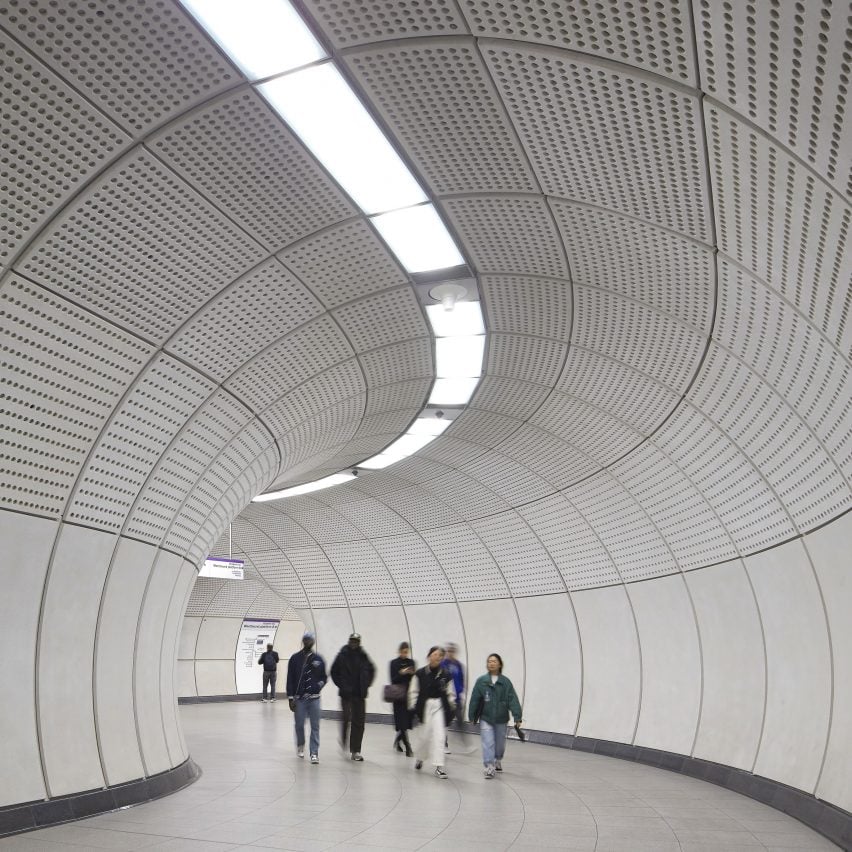
This video highlights the Elizabeth Line infrastructure by studios Grimshaw, Maynard, Equation and Atkins, which is one of six projects shortlisted for this year's RIBA Stirling Prize.
It is the largest project on this year's shortlist, which is the focus of a short-film series currently being published by Dezeen in collaboration with the Royal Institute of British Architects (RIBA).
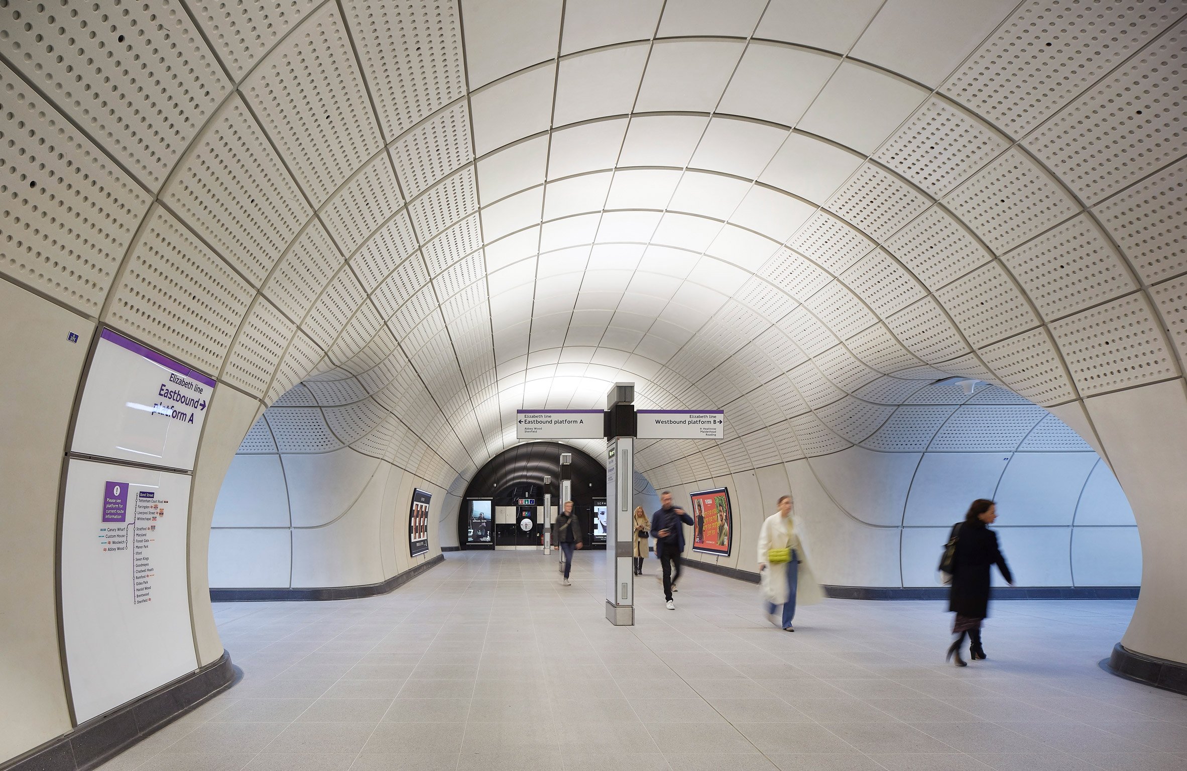
Described by RIBA as "a mammoth feat of construction and collaboration", the project overseen by Grimshaw, Maynard, Equation and Atkins is the biggest expansion to London's underground railway network for more than a century.
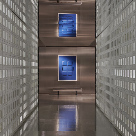
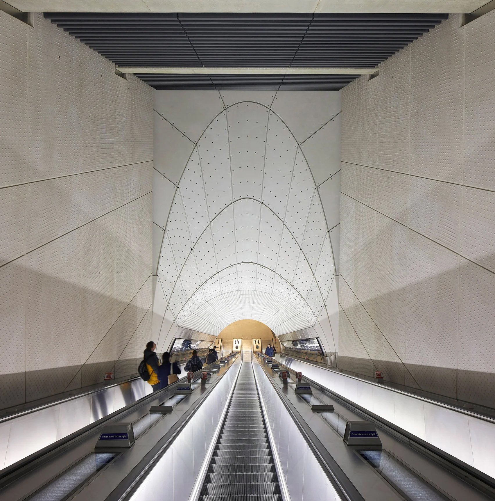
The Elizabeth Line, which will be used by 200 million people a year, is designed to appear both elegant and simple.
"The spaces have an elegant simplicity, but perhaps what passengers won't appreciate is all the effort that went into making these environments feel effortless," explained Grimshaw partner Neill McClements in the video.
To achieve this balance, each of the stations had a separate design team that worked within an overall design framework. This unified design becomes stronger and more clear the further passengers travel from the station entrances.
"Each station had a different design team and they were tasked with integrating the stations sensitively into the surrounding historic fabric of the city, but the client also wanted a consistent and familiar experience for passengers across the line," said McClements.
"We developed a strategy where the architecture of the ticket halls had a strong, local identity, but as you move below ground the line-wide identity gets stronger the closer passengers get to the trains."
Yesterday, we featured a video of the Chowdry Walk social housing in London by Al-Jawad Pike as the first part of this mini series.
Over the coming days we will feature the other projects on the Stirling Prize shortlist – Phase 2 of the Park Hill estate regeneration in Sheffield by Mikhail Riches, the Wraxall Yard holiday accommodation in Dorset by Clementine Blakemore Architects, the overhaul of the National Portrait Gallery by Jamie Fobert Architects with Purcell and the King's Cross Masterplan by Allies and Morrison and Porphyrios Associates.
The film was produced by the RIBA and the photography is by Hufton + Crow.
The post Elizabeth Line designed to have an "elegant simplicity" appeared first on Dezeen.
What's Your Reaction?


