Vaga Arquitectura and Pistache Ganache wrap Brazilian store in undulating "membrane"
Brazilian studios Vaga Arquitectura and Atelier Pistache Ganache teamed up to design a "consumer-first" boutique outfit with curving coral walls for a mattress company in Sāo Paulo. Renovated in 2024 by design studio Vaga Arquitetura and luxury retail designer Atelier Pistache Ganache, the narrow store sits on the end of a block in the Pinheiros neighborhood. The post Vaga Arquitectura and Pistache Ganache wrap Brazilian store in undulating "membrane" appeared first on Dezeen.

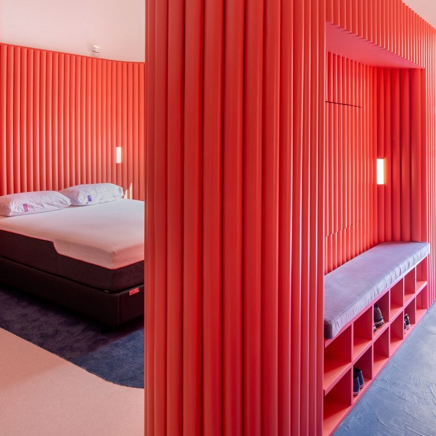
Brazilian studios Vaga Arquitectura and Atelier Pistache Ganache teamed up to design a "consumer-first" boutique outfit with curving coral walls for a mattress company in Sāo Paulo.
Renovated in 2024 by design studio Vaga Arquitetura and luxury retail designer Atelier Pistache Ganache, the narrow store sits on the end of a block in the Pinheiros neighborhood.
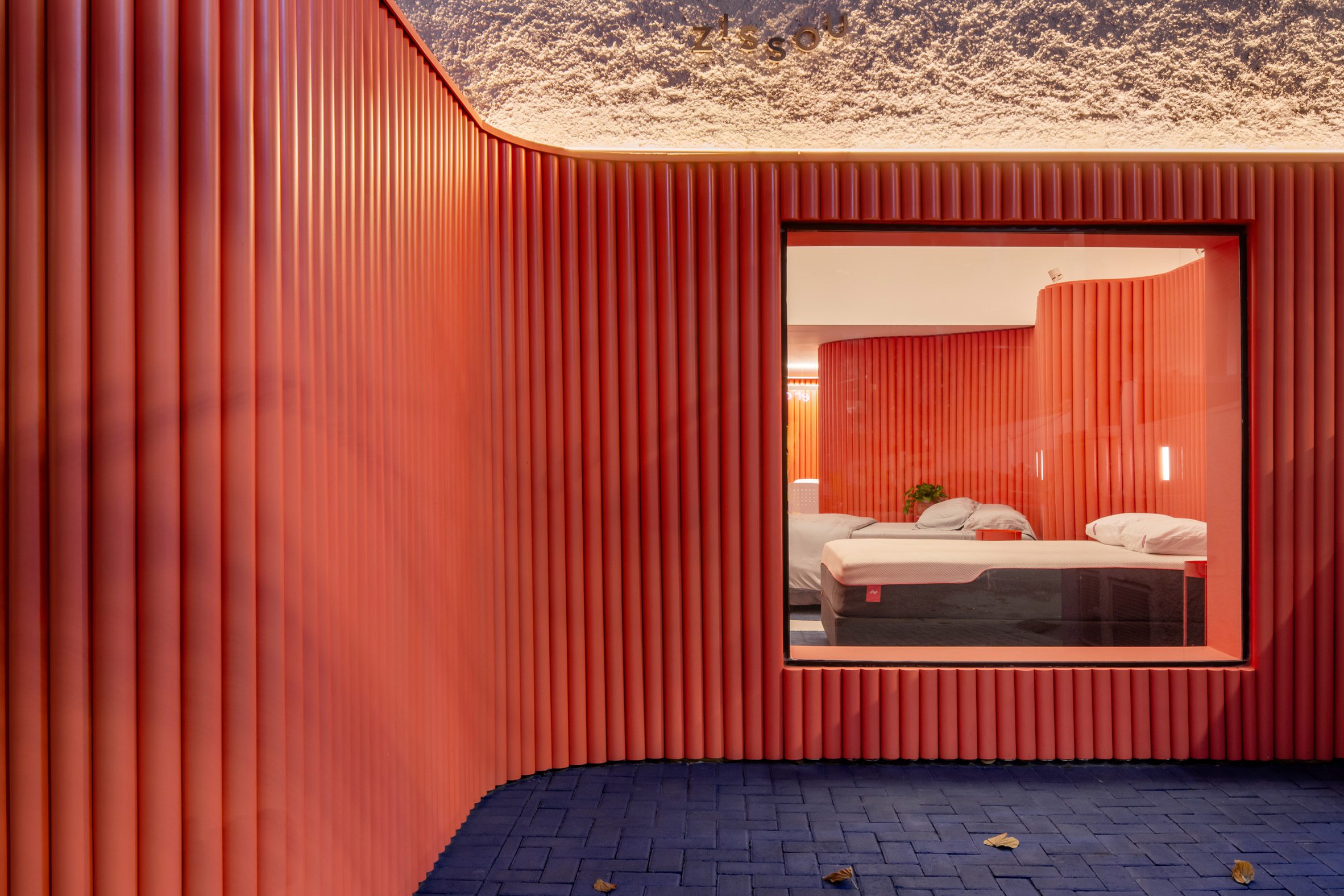
The 162-square metre (1745-square foot) space is the new flagship store for Zissou, a Brazilian startup that specialises in "mattresses in a box" and other sleep products.
A pink-toned fluted facade treatment wraps around the ground level of the storefront and is punctuated by a large plate glass in the centre, while the second level is composed of white stucco with the brand's sideways Z-shaped logo stamped into the centre of the facade.
The coral facade bubbles out to mark the store's corner entrance, meanwhile forming a small front courtyard with the neighbouring wall. The sidewalk pavers are painted with a bright indigo hue to define the area.
The three-colour palette and soft curves continue inside the store.
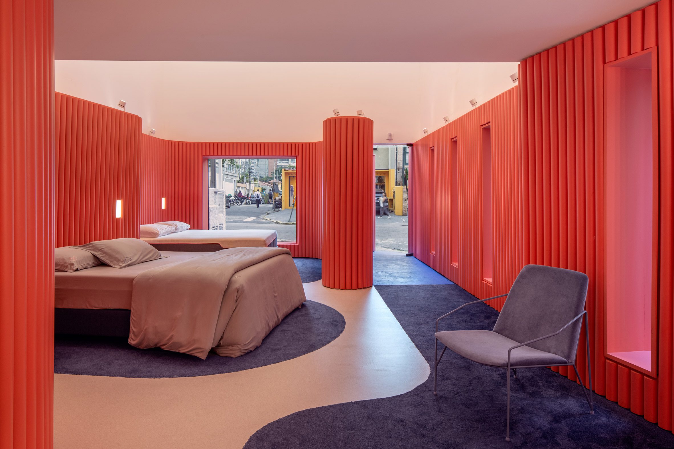
"Our goal was to create an immersive and sensory experience that maximized the integration of the online and offline journey, always keeping the customer at the centre of everything," the team told Dezeen.
"Inspired by the theme Layers Between Sleeping and Living, we designed a horizon in the space using a coral pink membrane, which, along with the lighting treatment, represents the space between the sky and the earth, connecting sleep with everyday life."
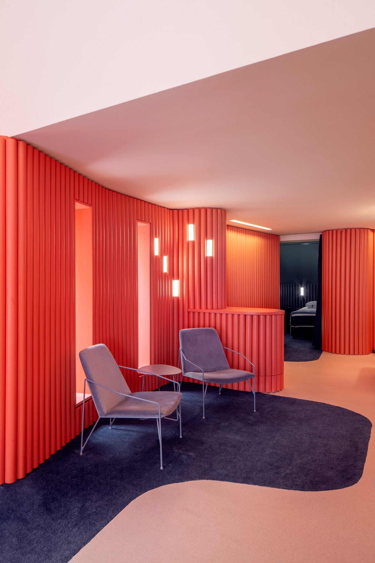
"Visitors are guided through this fluid and inviting environment, designed to spark curiosity and offer a unique experience tailored to each product, culminating in spaces that provide a singular journey."
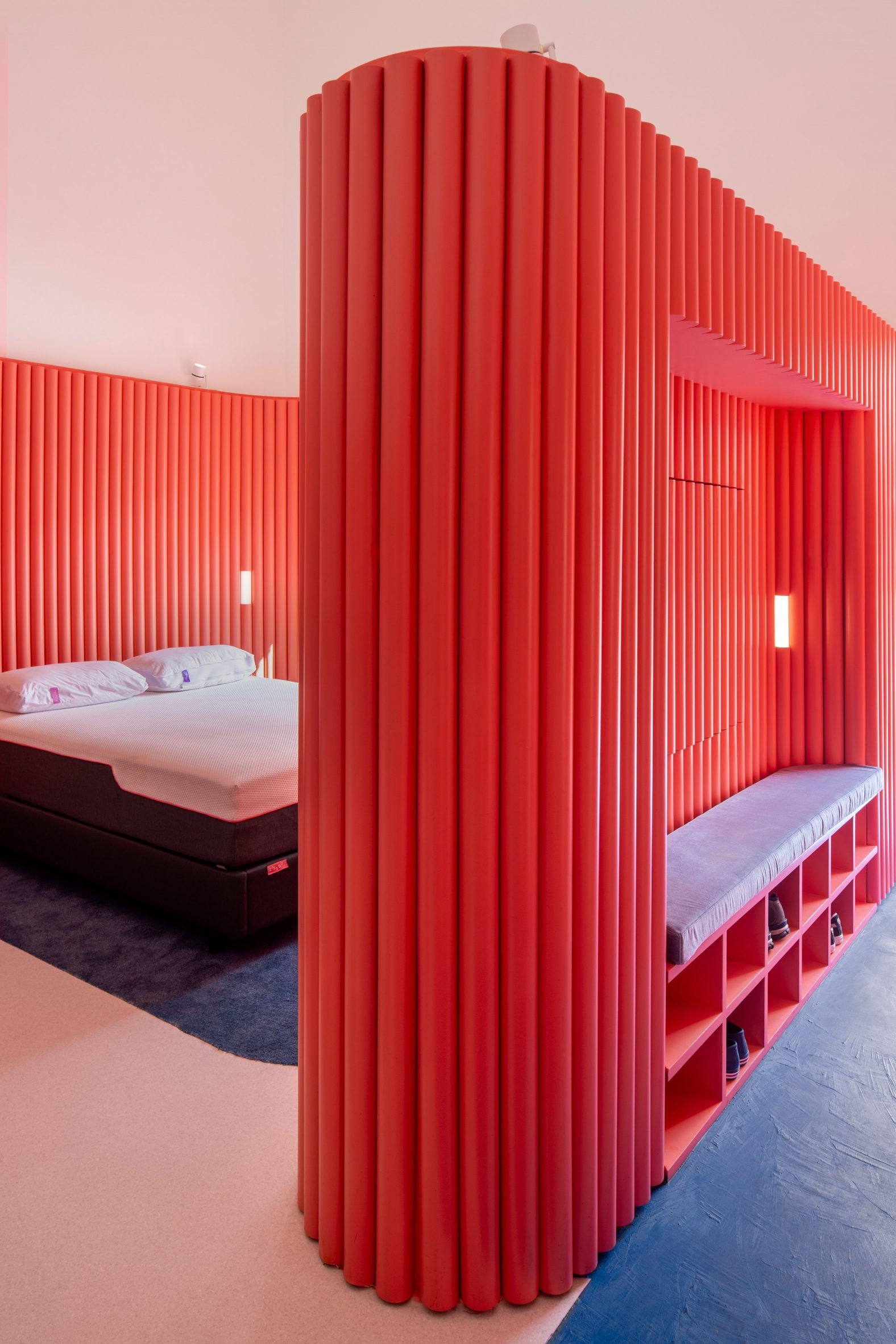
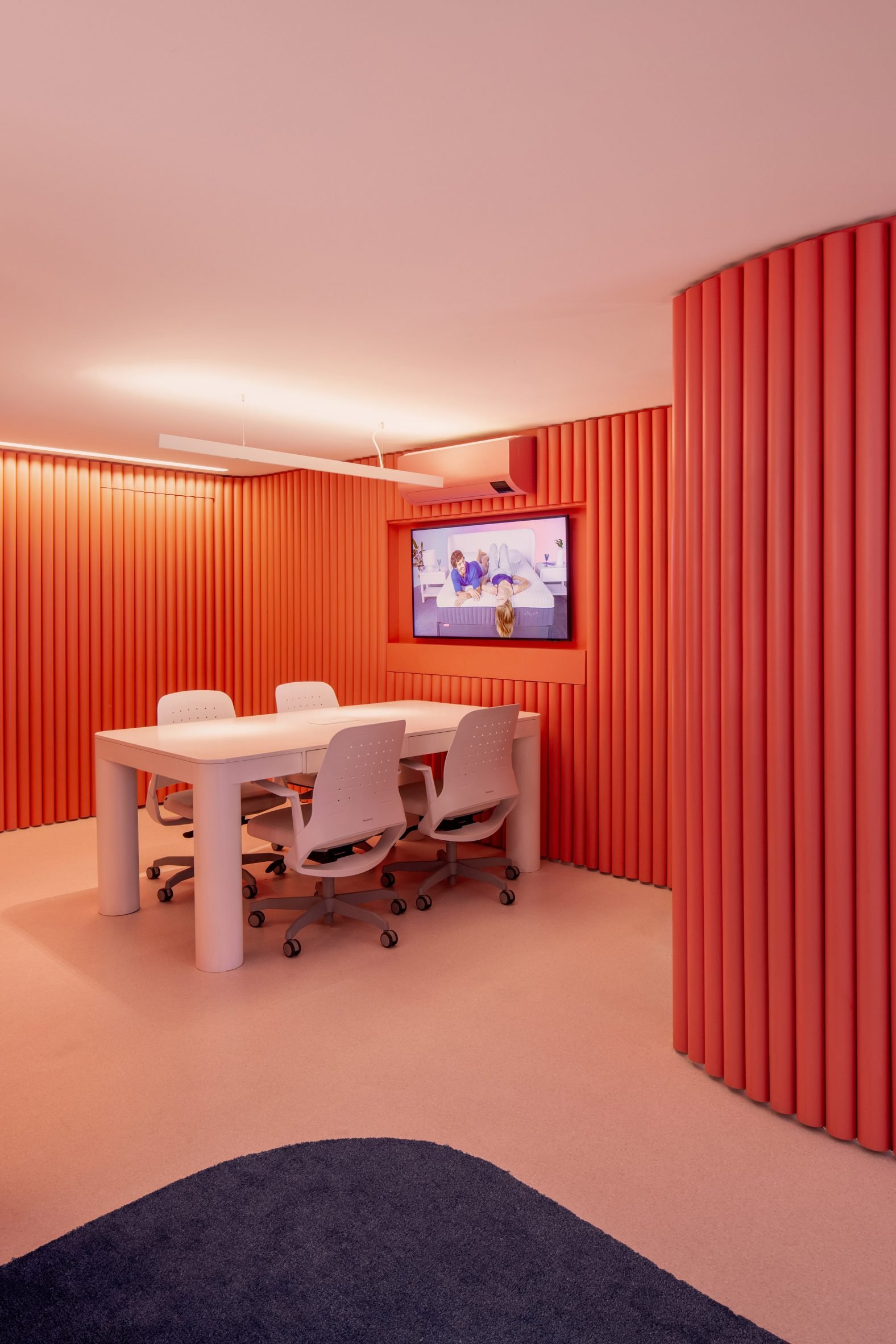
The custom pink membrane mimics the softness and technology of Zissou's products and flows through the space dividing the linear footprint into smaller rooms along a grid system.
"The idea is that this element arouses the curiosity of those passing by on the sidewalk, encouraging them to enter the store for a unique experience, designed for them along with Zissou's team," said VAGA Arquitetura co-founder Pedro Domingues.
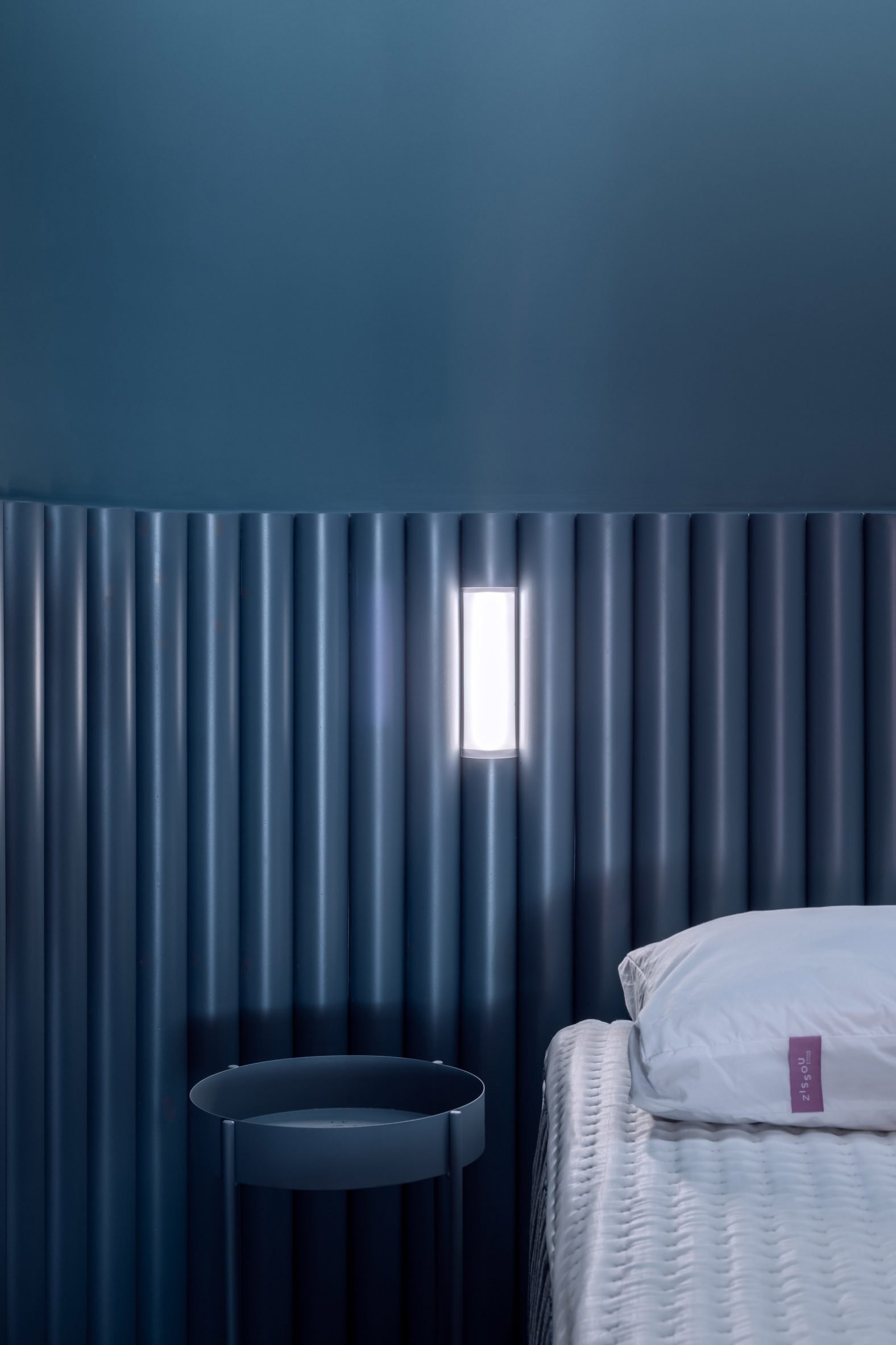
In contrast to the coral walls, plush dark blue carpet – experienced after customers remove their shoes when they enter – directs circulation between the spaces and leads to the secluded Blue Room in the back corner offering "an immersive and automated experience, with controlled sound, light, and temperature."
"The entire space was redesigned so that the store's initial concept could be realized: creating specific environments for each product, so that each offers a unique experience," said said VAGA Arquitetura co-founder Pedro Faria.
The team dismantled the old wooden mezzanine, opening the interior to a white double-height ceiling above the pink horizon line and creating a sense of decompression.
An enclosed spiral staircase leads to the upper level, where another retail space opens to a back terrace for hosting brand events.
Other flagship stores recently completed across the globe include a boutique with silver curtains and a burgundy stage for Danish womenswear label Rotate, designed by Thaibaut Allgayer in Copenhagen, and a pyramid-shaped store for drone brand DJI in Shenzhen, China by Various Associates.
The photography is by Carolina Lacaz.
Project credits:
Architecture: VAGA Arquitetura + Pistache Ganache
VAGA team: Pedro Domingues, Pedro Faria, Gustavo Naoki and Ingrid Rosa
Pistache Ganache team: André Romitelli and Martina Brusius
Collaborators: Roberta Tannus
Construction: BeFive
Structure, electrical installations, and hydraulic installations: Jarreta Projetos
Lighting Design: Lichia Lighting
Scenography: GTM Cenografia
Client: Zissou
The post Vaga Arquitectura and Pistache Ganache wrap Brazilian store in undulating "membrane" appeared first on Dezeen.
What's Your Reaction?


